Friday, 20 February 2015

Vis Com #5 - Magazine Illustration

Brief: Illustrate an article for a science magazine about the Great Barrier Reef.

I ended up doing a cartoon-ish style as I enjoyed brief #2 so much, even though it was not fitting for the brief at all, I just ended up drawing and exploring my technique at drawing in a bold fashion. Even though the point was to make something that fit the brief but I kind of went off tangent in this brief without meaning to.


I enjoyed experimenting with doodles and playing with composition and I learnt to use positive and negative spaces with small figures and drawings. If I had to do this again I would have made it more realistic.

Wednesday, 18 February 2015

Vis Com #4 - Painting Cakes

Brief: Paint the cake given and show a use of different media materials within the sketches and the enlarged version.


Here are side by side photo and painting of the cake I was given.

I did like this short brief even though I felt like it was quite an easy brief because I've done things like this before and I wanted to be more challenged, so I felt this was just a 'draw what you see' day. I did try to do things more loose and expressive with my sketching piece of the cake which I enjoyed.

Friday, 13 February 2015

Vis Com #3 - Gender Identity

Brief: To produce a visual solution to protest or promote one of the following issues from a list.

I chose gender identity because it is still not known to some people that it seriously impacts people's everyday lives, for example, feel uncomfortable with the fact that you are really a woman mentally but you are typed as a man because that was how you were born and you fear to become an outcast or seen as far from the 'norm' or strange/crazy if you try to change yourself to feel more like your real self. It raises questions like if there's really a gender or just because genitalia is different to some others, we've created a socially acceptable name for people who have one or the other? Places like the US have come together as a community to create the LGBT to make people aware that it's "OK" to be transgender, 'gender-queer', or to dress as the opposite sex etc.
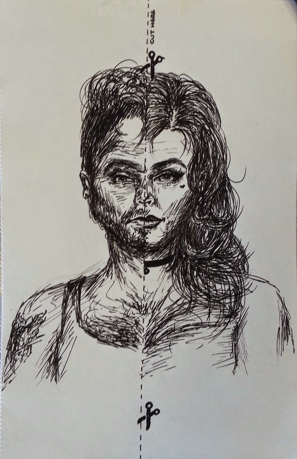
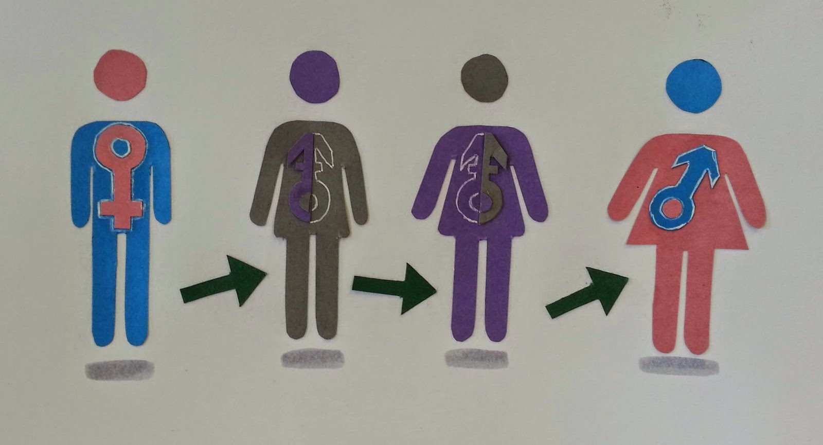
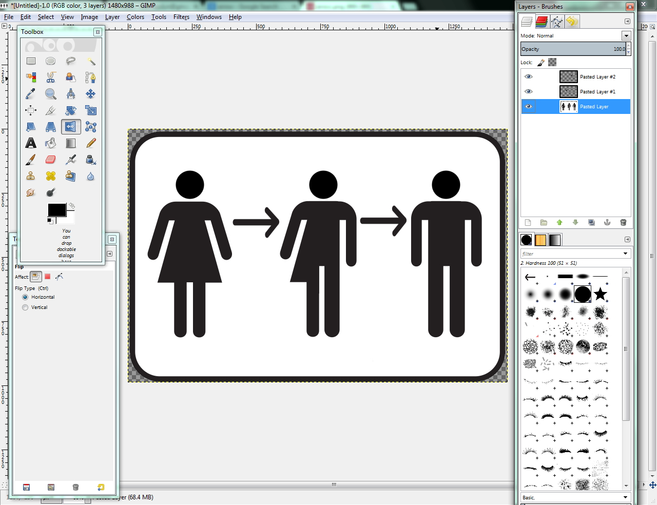


Here are some images of my progress through developing ideas of mine. I used sketches, collage, text based things when I got ideas off of Tumblr and Whisper, and other ideas I thought of; I just drew them out as experiments. My "TRANSition" idea came from the isotype of what are used to show male and female bathrooms. I used a handwriting type for the 'trans' part to show a personalized look and to symbolize the meaning of being transgender.


 Here is an experiment I made with make up and how I could transform someone male to female. I followed the same process as drag queens (via YouTube make up tutorials) putting on their make up. Obviously it's not perfect (it was difficult to cover the eyebrows entirely), but it was only an experiment.


I did another shoot which I made the situation the other way round (a feeling of a man trapped inside a man's body). I used Barbara Kruger's aggressive arrangement of words to make it have impact in the message.


Here shows me drawing on my photos to make them more masculine. I left these as drawn because it gives more of a personal feel to these, as if the person themselves drew what this girl would want to see if they were a man. I also show how I graft on pieces of my body onto other photos and my finished work all up on display.


I did enjoy this project because I researched into how people feel and live by being transgender and I could really immerse myself into the everyday lives and how they live their lives, I did find it quite interesting.

Monday, 2 February 2015

Vis Com #2 - Illustrate a Map

Brief: Choose a country from a list and create it visually interesting and informative by using illustration and graphic design (including typography, photography etc.)

I chose Japan because it could give me a chance to draw in a more quick cartoonish way that I could end up liking or not, but I think of it more as practice in an area I am unfamiliar with. I also chose Japan because of its cultural stereotypes and their nightlife in the capital city i.e.; all the flashing lights and nightlife.


Here are some sketches I started out with. These are showing cultural cartoon sketches of their fonts they use, the landscapes and the cartoon pictures they have around Japan.


Here are some further development of mine and exploring further into the font types, cartoon characters made by Japan (anime/manga style drawings) and how the map will be presented.


I discovered some illustrations of fish commonly seen in illustrations from Japan and I tried to recreate these in different styles. I prefer the more precisely drawn one (the right) comparing to the left one because it has a crisp finish to it, unlike the left one. I chose the right fish to develop further to photo manipulate later on.


I found some images off the internet to show how could a Japanese font type could be shown in a illustrative way and these were my favourite four images.


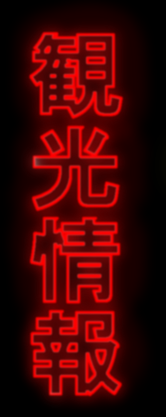
Here are my interpretations of the text pieces I found on the internet. I enjoyed making the LED looking lights/signs more than the others because they are simple and very effective, in my opinion. I just made the text into a border shape, made in the inside of the shape disappear, made a second layer and create a glowing/blurred effect of a colour behind the first layer to make it look like an LED light effect.


I used the fish I drew and removed the background (so it can be easily layerable if I think of anything else), took inspiration from the text made illustrations I made previously and merged them, then tried to combine all the ideas and create a Japan shape round the images. It looks all clustered in the last image but it shows its the country of culture and a burst of colour comparing to some places round the world; Japan is known for its outrageous fashion, culture events, cosplays, drawings (anime, manga, chibi) etc..

I did enjoy this as I could try different ideas and not just drawing what I see; I could try and be a little more basic as well as more colourful when I draw. If I could change some things I would have changed how I planned my work i.e.; research the culture in more of information based stuff first, rather than go straight in with drawing, as this is what I tend to do; just to brainstorm ideas first and forget about the information required as well.